15 List of Responsive Web Design Part 2
by: Mark Abucayon on November 23, 2011 in Web Design InspirationThese days websites are not only viewed on a standard monitors but also on mobiles, ipad, smartphones and a tablets, it now uses media queries to provide an optimal presentation that look good on multiple device monitors. Today I will be showcasing 15 different websites that uses media queries, please resize your window to see what I’m saying. Please dont forget to and for daily blog updates.
Indubitablee
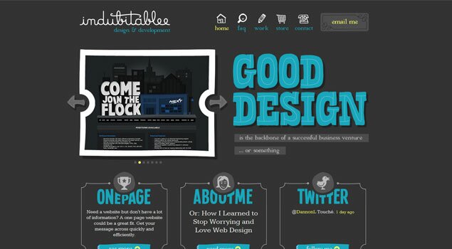
CSS Off
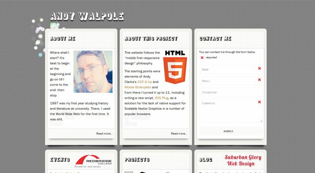
Andy Walpole
We Are O3
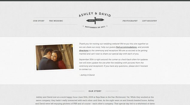
David and Ashley 2011
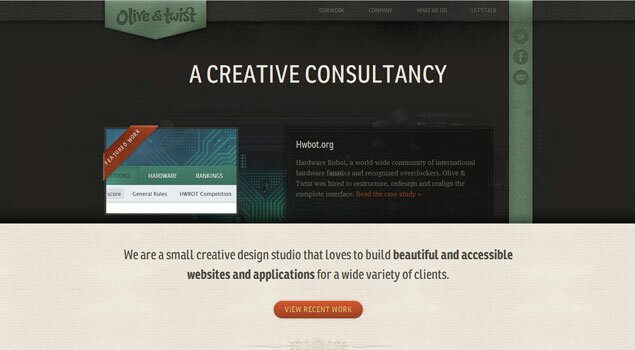
Olive and Twist
Ramon Lapenta
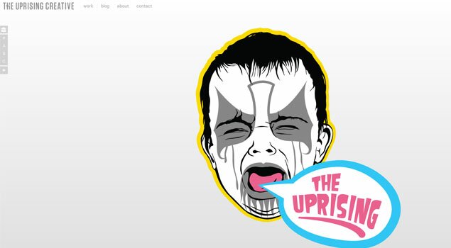
The Uprising Creative
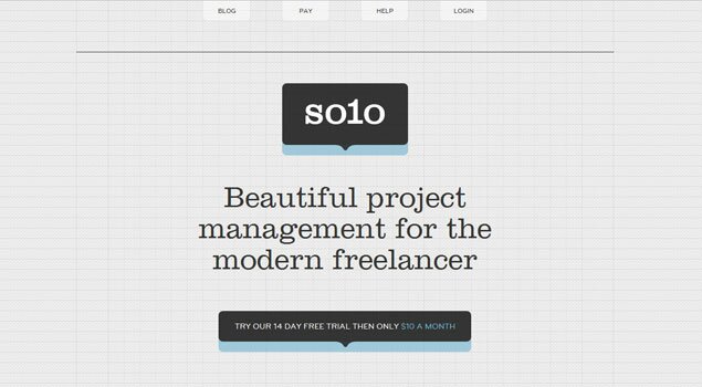
Thrive Solo
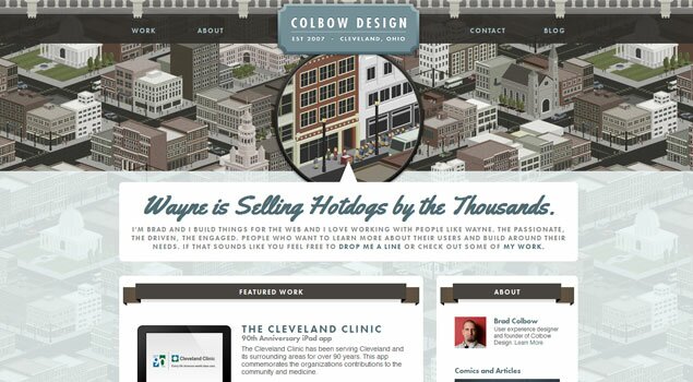
Colbow Design
Big Bite Creative
Zoink
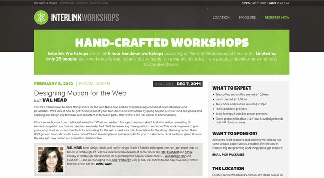
Interlink Workshops
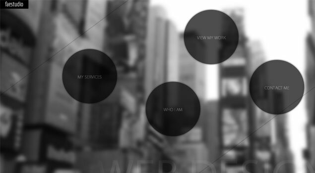
Fae Studio
Mix Forms

About the Author
Mark Abucayon
Visit Personal WebsiteHello Everyone my name is Mark Abucayon Freelance Web Designer and Developer from Philippines, in short call me Mabuc.
Please check related post:
Post a Comment to Designartwall
Your email is never published. Required fields are marked *
All comments are moderated. Inappropriate and non constructive comments will not appear.







5 Responses to “15 List of Responsive Web Design Part 2”
Danny Watson
2012-03-23
Wow! This is really awesome. Some of the headlines pictures are vanishing to provide for the lesser displays. This is creating us think now.
Ray Creations - Web Design
2011-12-12
It is a good idea, loading different css files by detecting the browser window size, and thereby changing the entire website interface. However, this implies that css3 be used which is only supported by modern browsers. Therefore, you will not see widespread use of this technique as of now, however, it will become popular over time, as you do not need to have separate website versions for different devices. SEO implications of this technique will also need to be considered.
Ray Creations - Web Design
2011-12-04
Wow! This is really cool. Some of the header images are disappearing to accommodate for the smaller screens. This is making us think now.
janko bosch
2011-11-23
I certainly enjoyed this post. Thanks for adding my site.
Soon with responsive video…:)
Designartwall
2011-11-24
your welcome janko.. you have a nice website